

As I sat on the couch at my mom's house last August, nursing my brand new son and allowing my two and a half year old to watch another episode of Caillou, I dreamed about the endless possibilities for our new home. Knowing a re-do was in the works, how would I narrow down the options to something that is both stylish, affordable and functional for my family? What colors would I use? How would I turn around the absolutely horrid kitchen we had inherited? And for the love, how were we going to tackle all that there was to tackle with two tiny, needy humans demanding to eat and be cared for?
It was this picture that got my design juices flowing:

Obviously, my kitchen is nowhere near this grand. Here's what I loved about it: 1) that awesome grey color on the walls. 2) The white cabinets and hardware, and the contrast with the walls. 3) The dark island. 4) Those lights (swoon). 5) The clean lines. Very simple and no-fuss, but elegant at the same time.
Knowing that we had to take down the ugly, copper-wanna-be backsplash and that it would undoubtedly leave a mess which could require drywall work, lighting struck and I remembered how we had disguised the holes in our last home's basement walls using wainscoting, and how super awesome it looked.
 |
| You'd never know that all this was born of the fact that we're too lazy to patch holes in drywall. |
I was actually beginning to pat myself on the back and give myself kudos on my design plan. It was pretty clever and original.
Or so I thought. A few months later, I would open the November 2012 issue of Better Homes and Gardens to find this image:
 |
| Yes, it's in a 3 ring binder. Partly because, this is what I've always done since before Pinterest existed; partly because I'm a teacher and we think everything looks better inside a 3 ring binder and page protectors. True Story. |
....So, that's pretty much the kitchen I designed in my head, just on a much larger and more grandiose scale. Turns out, I'm not quite as original as I would have liked.
But I still liked the look, and I comforted myself in the thought that there's really no such thing as "original" ideas. It's all been done before, right? The Lion King is no less awesome just because Shakespeare did it as Hamlet.... right? So, full steam ahead on the kitchen remodel front. In January, I set about looking for paint colors. I went to my lovely Benjamin Moore store and came home with two options:
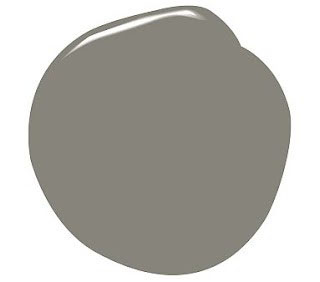
Chelsea Gray

Texas Leather
I was on the fence about which one I liked better.
Then, around Valentine's day I happened across her blog, and this kitchen:

But I'd like to think that she and I would be friends if we ever met in real life. Because guess what color she used on the walls? That's right. Texas Leather, by Benjamin Moore. Which sealed the deal for me, because her kitchen is about as drool-worthy as they come.
And so we set to work, and even though I come off like a giant copy-cat, I couldn't be more pleased with the result. It's exactly what I envisioned on that long-ago couch with my ta-tas out.

Sources:
Paint: Benjamin Moore Texas Leather
Cabinet/Wainscoting Paint: Behr Decorator White {in the shiniest finish possible, that's important}
Island: Rustoleum Cabinet Transformations in Espresso left over from our bathroom make over at the old house.
Above-sink light fixture: Home Depot
Flooring: Lumber Liquidators and installed by my super awesome and handy husband
Shelving: IKEA
There are still a few things I'd like to add at some point. Bearing in mind the fact that we had literally an entire house to redo, we definitely cut some corners in terms of cost. I'm in love with this faucet, but no way do I love the price tag. I also loved light fixtures along these lines: this, this, this {and can you tell I'm a fan of my PB catalog?} and this for a change of pace. The one we got from Home Depot had a similar feel but at a fraction of the price.

I like its unique characteristics, and at less than $70 it feels like a comparative steal. The baskets came from Walmart. I tell you, I looked forever before buying these. I'm loving wire baskets right now, but the price tag that comes with them is a little ridiculous. Maybe paint the pantry door so it doesn't stand out like a sore thumb.

And, yes, you caught me. {Can't get anything past you guys! Yeesh.} There is a hole in the ceiling above my stove.

You see, we had a little leak from the master bath, which sits up there. In, like, the winter. And, we've been....er... working to get it fixed. We just... you know... had to wash our hair and stuff.
So that's that. I hope it answers any lingering questions. If it doesn't, just check out those other options - they've done it better anyway. :)
AND: for those of you who asked about wainscoting and how to do it, my lovely hubby will give us some hints and tips next week. Stay tuned...
Have an awesome weekend!

No comments:
Post a Comment